The U.S.
Boston City Hall, Boston
Boston City Hall by Wikimedia Commons
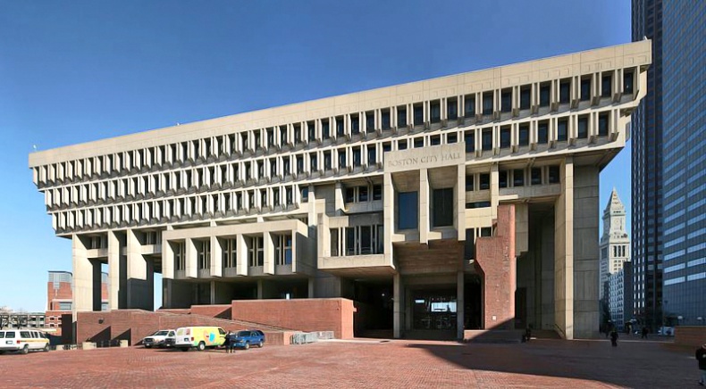
If you ever come across a list of the world's ugliest buildings, Boston's City Hall will most likely be there. You probably won't be surprised if I say that it was built in the architectural style of brutalism, which was characterized by one of its strongest supporters, Reyner Banham, by formal legibility of a plan, clear exhibition of a structure, and valuation of materials for their inherent qualities 'as found.'
The building itself has long been an object of jokes. Often described by locals as "a big concrete jail" or "the Hulk," this unaesthetic structure gets criticized from all sides. Boston's current mayor, Thomas Menino, is so fed up with the look of the building that he has proposed to tear it down completely and build a new city hall somewhere on the South Boston waterfront. However, his idea is likely to face a lot of obstacles because there is a group of architects and preservationists who are trying to give it status as a historic landmark.
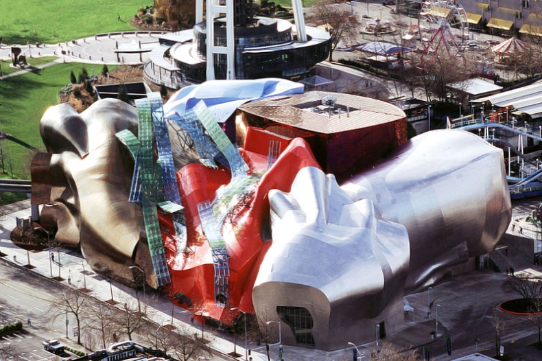
EMP Museum, Seattle
Some call it Seattle's most iconic building, others its ugly duckling. Well, it's not easy to decide who's right. EPM or the Experience Music Project Museum was founded in 2000 by Paul Allen, a co-founder of Microsoft with Bill Gates. The 140,000-square-foot building was designed by renowned Toronto-born architect Frank Gehry, who is known for his dramatic designs such as the Fish Sculpture in Barcelona, the Dancing House in Prague, the Guggenheim Museum in Spanish Bilbao, and the Lou Ruvo in Cleveland.
Don't let the museum's unusual façade discourage you from entering since it usually hosts some of the coolest exhibitions in the city. Moreover, it includes features such as Sound Lab, an interactive space with a series of soundproof rooms in which visitors can try out all the available tools. On Stage is another interactive feature through which you can see what it's like to be a star and perform in front of a virtual audience. Visitors can enter a famous IF VI WAS IX and all sci-fi geeks will definitely love the Science Fiction Hall of Fame.

EMP Museum by Wikimedia Commons
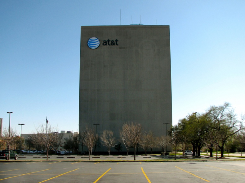
AT&T Central Office, Houston
Who on Earth would build a house without windows? AT&T! Or better, telecommunications corporations. This building is anything but attractive; however, the reason behind its horrible design is pretty understandable. The building is said to have no windows because it reduces the probability of dust getting into the building and creating problems with the equipment, it helps keep the area cool to prevent damage to servers, and it also reduces the damage caused by possible natural disasters.

AT&T Central Office by Bill Bradford
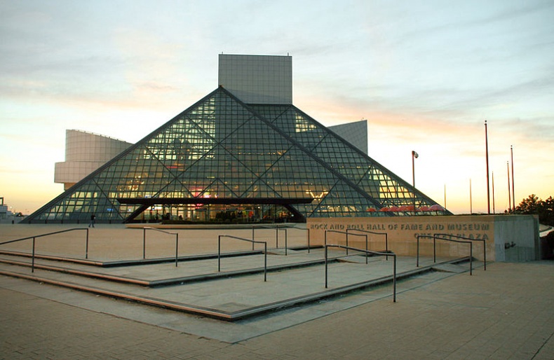
The Rock and Roll Hall of Fame and Museum, Cleveland
If you've ever been to Paris, you've most likely visited the famous Louvre Museum. Do you remember the pyramids located in the courtyard? They're called the Pei Pyramids because they were designed by I. M. Pei, a Chinese-American architect. The project of a steel structure covered with reflective glass has been the subject of controversy from its very beginning, although almost everyone now loves it. Cleveland's Rock and Roll Hall of Fame and Museum is another architectural work of Ieoh Ming Pei, which consists of a 49.5-metre-high tower and a pyramid-shaped museum with seven levels. This one, however, does not enjoy so much praise. Even its creator admitted that there is very little harmony in the building and its shapes. This might be the reason why it often tops the list of the world's ugliest buildings.

The Rock and Roll Hall of Fame and Museum by Wikimedia Commons
Tsui House, Berkeley
Have you ever heard of Tardigrades? They're microscopic organisms that are able to survive even the most extreme conditions. The 2000-square-foot property often called the "Fish House" was inspired by these tiny creatures and claims to be indestructible. The creation was built in 1984 by Bart Prince, the American contemporary architect known for his love for organic architecture. It's located on Matthews Street in Berkeley and was completed in 1995 at a cost of $250,000.
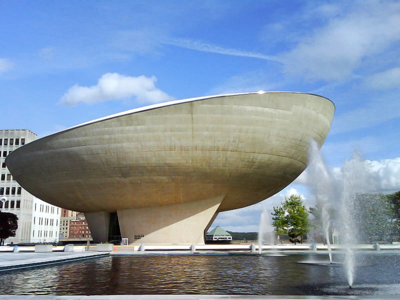
The Egg, New York
The Center for the Performing Arts, also known as the egg, is home to many quality performances. Wallace Harrison designed it as part of a large performing arts complex. The construction took 12 years to complete. It includes two theaters: the Kitty Carlisle Hart Theatre with 982 seats, which is used for major productions, and the smaller Lewis A. Swyer Theatre with 450 seats, which hosts chamber music concerts, multimedia presentations, lectures, solo performances, and the like. We have to admit that the unusual shape of the building creates great acoustics. But just take a look at it. Doesn't it remind you of a gigantic egg sitting on a pedestal? Such a world-class centre definitely deserves a much better design.

The Egg by Wikimedia Commons
Kettle House, Galveston
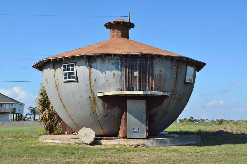
If you ever come to Texas close to the Gulf Of Mexico shoreline, don't forget to stop at 14108 San Luis Pass Road in Galveston. What you will find is a strangely shaped metal structure. Very little is known about it, but it's believed that this house was built by a man who was employed as a storage tank builder for oil companies. Neighbours claim that they sometimes see the man doing maintenance on his home, but he never talks to anyone and leaves as quickly as he comes. The most interesting fact is that it was strong enough to withstand one of America's costliest hurricanes, Ike.

Kettle House by Patti Haskins
Crosley Tower, Cincinnati
Another example of concrete brutalism is Crosley Tower standing on the Campus of the University of Cincinnati. The tower, named after Power Crosley Jr., an entrepreneur and inventor who owned the Crosley Radio Company, was designed by A.M. Kinney Associates, a local architectural and engineering firm. The University's obsession with tower-like buildings has come and gone, but the sixteen-storey building stands where it was originally constructed more than 40 years ago. Even though the University has already expressed regret over its decision to build the tower, it would be too expensive to tear it down now.
Spaceship House, Signal Mountain
Did you dream of being an astronaut when you were a kid? Well, some people never grow up. The idea of building this steel and concrete structure with three bedrooms, two full bathrooms, a kitchen, a living room, a large open bar, and an entertainment area was born when Curtis W. King decided to have it built for his son. The Star-Trek-inspired property was finished in 1973 and has changed ownership a few times over the years. The latest auction took place in 2008 when James Faris bought it for $119,000 U.S.
Hirshhorn Museum, Washington
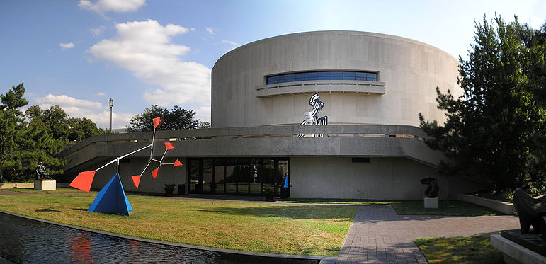
Joseph Hirschhorn was an immigrant Jewish boy who showed the world that with intelligence, determination, and little bit of luck, everything is possible. He was born into an extremely poor family, but after his father's death, Joseph, his eight siblings, and their widowed mother decided to try their luck in the U.S. Joseph's mother and his two sisters worked in sweatshops to feed the family. Joseph, despite his early age, decided to take his family's future into his own hands. Thanks to his observation skills and great ability to adapt, this young Lithuanian boy became a successful stockbroker and made $168,000 by the time he was 17 (on his initial investment of $250). Later on, he continued to work his way up and earned millions in the mining and oil industry. He was not only an inspirational entrepreneur, but also a true art lover. He donated his multi-million-dollar collection of approximately 5,600 works of art and an additional $2 million endowment to the U.S. government. His only condition was that the collection bear his name. The Joseph H. Hirshhorn Museum and Sculpture Garden was established in 1966 in Washington and the museum opened eight years later. Upon his death, he willed an additional 6,000 works and a $5 million endowment to the museum. The circular building was designed by Gordon Bunshaft and has received many negative reviews such as "The largest doughnut in the world."

Hirshhorn Museum by Wikimedia Commons
Canada
Art Gallery of Alberta, Edmonton
Art gallery buildings are always somehow extravagant. They are after all temples to art and civilization. Some architectural fantasies, however, go too far and often overshadow the art within. One such example is Edmonton's art gallery.
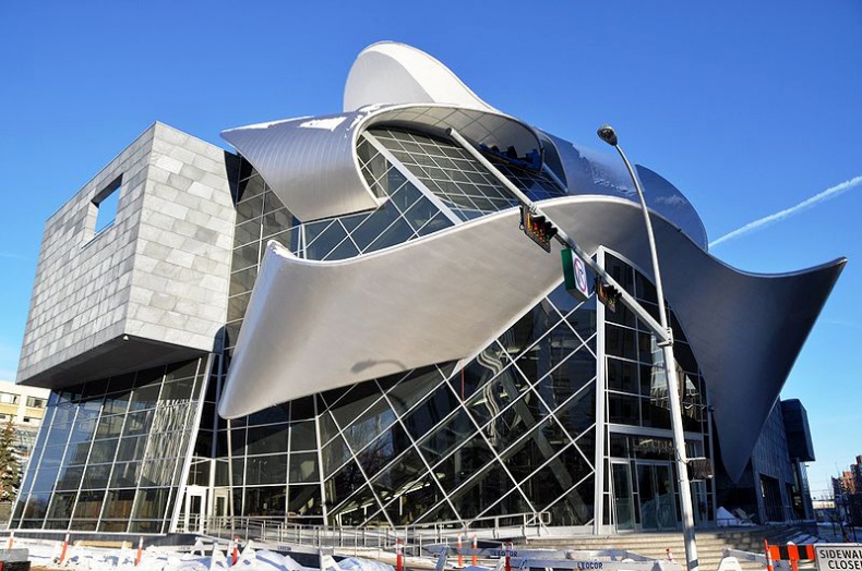
The 85,000-square-foot venue was originally built in the brutalism style. Once the city had enough of the concrete austerity and greyness, Randall Stout Architects were asked to give the gallery a new look. $88 million was spent on renovation, but the result was very controversial. Some people like its uniqueness and call it a great architectural addition, while others think that is looks messy and doesn't fit into the surrounding environment at all.

Art Gallery of Alberta by Wikimedia Commons
Habitat, Montreal
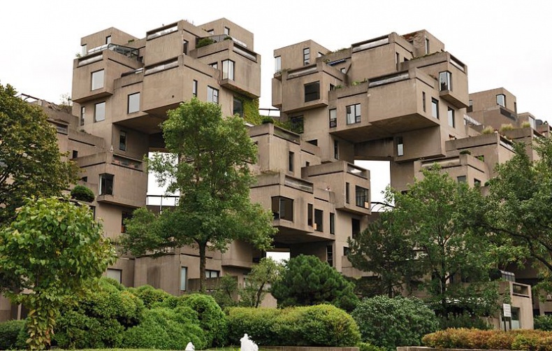
The 1967 International and Universal Exposition or Expo 67 is now just a distant memory, but the vast housing complex known as Habitat 67 reminds us that one of the 20th century's most successful World's Fairs was held in Montreal. Composed of modular concrete units, it is the result of Moshe Safdie's experiment aimed at creating affordable housing and an attempt to change common architectural patterns of that time period. He designed a huge complex with over 1,000 housing units, which were supposed to be used as temporary residences for visitors coming to the exhibition. The number of units, however, was downsized to 158. Safdie's vision of affordable urban dwellings consisted of onsite mass-produced concrete blocks that would differ in size (from 600 square feet 1,700 square feet) and therefore accommodate different types of families and create a truly diverse community. He preferred the units to be prefabricated onsite because he believed that it was more cost-efficient. For this reason, a factory was built beside the Habitat site. The whole complex was given a futuristic design with large plazas and monumental elevator pillars, suspended terraces, and unusual different angles. Unfortunately, it showed that the project was not as affordable as Safdie originally thought. It reached a total cost of more than $22 million, which represented about $140,000 per living unit.

Habitat Montreal by Wikimedia Commons
Vancouver Aquatic Centre, Vancouver
The Vancouver Aquatic Centre with its 50-metre tots pool, separate dive tank, diving boards, 7.5- and 10-metre towers, sauna, whirlpool, weight room, and fitness centre is a popular destination for Vancouverites of all ages. Seen from the outside, however, the asymmetrical design is not likely to enjoy much praise from locals. The windowless structure looks more like a bunker than a health and fitness facility. The surprising fact is that Duncan McNab and Partners' design has won several awards for its space-maximizing ability.
Toronto
The Marilyn Monroe Towers, Mississauga
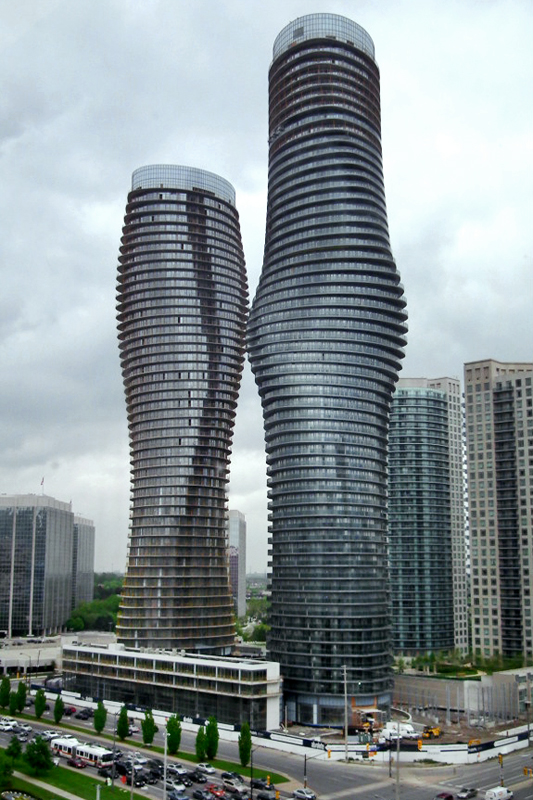
Pretty or ugly? That is the question. Well, this unit built by MAD Architectural Design Studio of Beijing must be somewhere in between. The company won an international competition for the landmark building of the Absolute World skyscraper complex, when they beat more than 90 rival submissions. The twisting, curvaceous design persuaded a panel of Canada's leading architects and planners and almost immediately was nicknamed "Marilyn Monroe."
When offered up as a per-construction sale, the majority of condos were taken within the first 24 hours. Because of high initial demand, the second tower was announced and sold out completely in approximately four weeks. The spiralling buildings are unique both outside and inside, but there is a group of people who think that they don't fit the aesthetics of the neighbourhood at all. While some Torontonians call it glamourous with sexy curves, others considered it bold and goofy, capped off with weird two-story window panels. Whatever your opinion, the fact is that out of the total project cost of $450 million CAD, more than half of that went into constructing the two controversial towers.

The Marilyn Monroe Towers by Wikimedia Commons
Sharp Centre for Design, Toronto
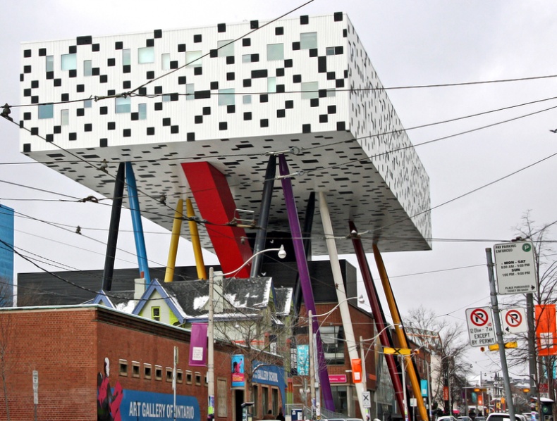
Another building that elicits strong opinions is located at 100 McCaul Street. Designed by a famous British architect, Will Alsop of Alsop Architects, in a joint venture with Toronto-based Robbie/Young + Wright Architects Inc., the structure has quickly become one of Toronto's most controversial landmarks. The building is actually part of the Ontario College of Art & Design. The most striking feature is a tabletop, box-like, white and black structure, which provides enough space for two storeys of classrooms, studios, offices, and student workspace. It is supported by 26-metre tall, colourful columns made of steel and weighing about 18,000 pounds each. Despite heavy criticism from many Torontonians, The Sharp Centre for Design has received many awards for its design.

Sharp Centre for Design by Bobcatnorth
Royal Ontario Museum, Toronto
Daniel Libeskind's crystal is the latest addition to the Royal Ontario Museum. When the museum decided to undergo a significant expansion and renovation process, Libeskind came with a concept of "The Michael Lee-Chin Crystal," the 16,200-square-metre structure that would co-exist with the historic ROM building, but it would stand separately. The American architect beat more than 50 other renowned architects and the realization of his project was set to begin. The complex, made primarily of glass, aluminum, and steel, was completed in 2007. It's home to eight galleries, shops, restaurants, a spacious entrance, and a lobby.


